Wild Turkeys T-shirt Designs
Posted here are some of the T-shirt designs that we've been working on. Comments, suggestions and alternative designs are welcome. Send them to Sam and Mark.
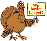
Here's the design of our team's original T-shirt from 1990, featuring one multicolored turkey and the words "Wild Turkeys" in black script on a white T-shirt. Also posted are various pieces of this design for anyone who might want to play with it:
Also here's a picture of Sam wearing his original T-shirt (with the orangish colors washed out to shades of brown after nearly two decades of use, and his misprinted T-shirt with its "Wild Turkeys" name in mirror-image black script.
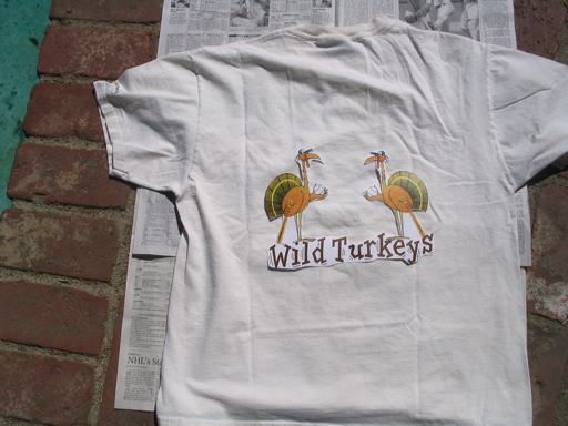
Our two-turkey design is inspired by the classic St. Louis Cardinals logo. The Cardinals' logo has two birds perched on a bat resting on the "Cardinals" name.
The two-turkey design currently consists of the original multicolored turkey and its mirror image, facing each other. The "Wild Turkeys" name can be in the original black script or a different font. I've tentatively picked the "TremorITC TT" font because it looks quite a bit "wilder" (and also somewhat easier to read) than our original script font.
Since our turkeys are already holding their bats (unlike the Cardinals' cardinals), I just positioned them to stand on top of the "Wild Turkeys" name. One turkey stands slightly higher than the other, which makes it a little more interesting than if they were positioned completely symmetrically. This is the tentative two-turkey design.
In the two-turkey design, it would be nice if the two turkeys were drawn so that they could be interpreted as boy and girl turkeys to signify our participation in a coed league. But my artistic and Photoshopping skills are limited to creating a simple mirror image!
Color selection and color coordination
What color T-shirt should the turkey logo be printed on?
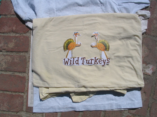
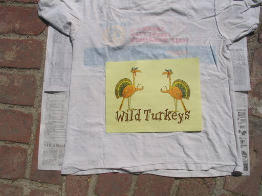
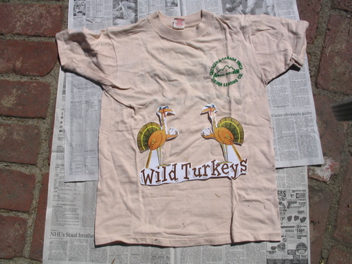
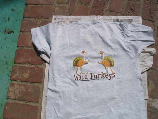
Given that the predominant colors of the turkey itself are various shades of yellow, orange, and brown, there's a limited selection of background colors that coordinate well with the colors of the turkey. Here are some possibilities, though it's not too likely that our exact optimal color shade will be available at the T-shirt shop. Except for the case of a white background, these are photos taken of a paper cutout of the two-turkey design against some old T-shirts (and one old bedsheet) of various colors and shades:
My opinion is that white is too unremarkable: of all my T-shirts, my two original Turkeys shirts are the ones most easily mistaken for a plain white undershirt. Other white T-shirts of mine tend to have bolder logo colors and designs that cover more of the area of the shirt than our turkey or turkeys.
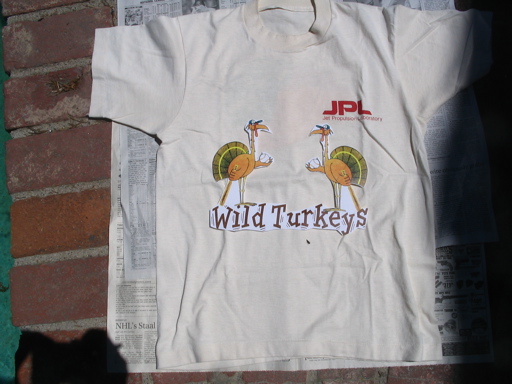
Pale yellow (such as the shade on my old shirt with the JPL logo) seems like a good color background, distinguishable enough from pure white but not overpowering. Brighter yellow shades can overpower the colors in the turkey. Light tan and light gray also seem like reasonable possibilities. Jet black is a sharp-looking and bold alternative, but we may regret choosing black when the temperature is 95 degrees in the summer!
The dark brown "Wild Turkeys" name looks pretty good against all of the light backgrounds. If we picked black T-shirts, we'd have to lighten the color of this font.
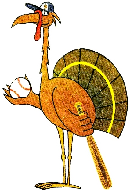
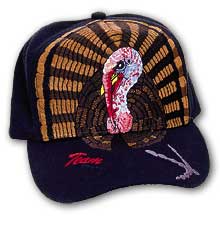
We may also want to coordinate our T-shirts with our team caps. Since our caps are black, is this a good enough reason to pick black T-shirts? Should we try to match the colors in the tail of the turkeys on our T-shirts to the brown and bronzish colors in the tail of the turkey on our cap? Here's a picture of our team cap in action to help you imagine what the cap and shirt will look like when worn together.
Scaling of the logo
When the turkey and the "Wild Turkeys" name are printed on the T-shirts, how large should we make these images? What's the right scale?
The paper cutouts of the two-turkey design that I photographed against different backgrounds are a bit too small against a normal-size T-shirt (but not by a lot). To get the paper cutouts, I scaled the design as large as possible to print within a standard 8 1/2 by 11 sheet of paper. I estimate that the whole design could be stretched by another 20% or so for printing to a T-shirt.
Should the two turkeys be standing on the "Wild Turkeys" name, or not? Separating them would give more flexibility in scaling and laying out the individual elements on the T-shirt.
Alternative designs
Which basic design do you prefer, one-turkey or two-turkey? Do you have comments or suggestions on all the other variables? If so, send them to Sam and Mark, or discuss them at our team practice on Thursday.
If you have an alternative design in mind, submit your ideas to Sam and Mark, and we will post them here for everyone to see.
Debbie is coordinating the final production, so please talk to her first before investing a lot of time or effort in creating a totally new design or substantially reworking one of the current designs. Before you go in this direction, make sure you know from Debbie about all the additional constraints imposed by the silkscreening process that our design must adhere to. But if you're just commenting on the various current design alternatives, your comments and suggestions won't require a lot of time on your part and yet they will be very valuable in guiding us toward a final selection.
|
